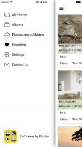
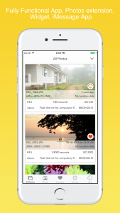
In version 3.0, We are ditching hamburger menu and going to use Tab-bar. Hamburger menu is one of controversial topic in UI/UX Flow.
In our case, During user testing we discovered only 35 percent users are only discovering hamburger menu, without which 90% functionality of our app can’t be discovered :-/ . Also user will have to leave context of a screen in order to access settings from hamburger menu. Which is one of worst nightmare for our users
TabBar is best replacement UI we were able to think of. Here is how new UI Looks like with Tab bar at bottom


Link to our EXIF Viewer App: https://itunes.apple.com/app/exif-viewer-by-fluntro-view/id944118456?mt=8
Do let us know your thoughts.!
Do you work on or recommend a windows app as well?
–Robert Sterbal 412-977-3526 call/text
Sorry, Our app is exclusively available on iOS Platforms.
On Windows, If you right click on image and then select Properties > Details tab, you would be able to see most important EXIF Tags.
Thank you!
There is actually a neat command line exif viewer for Windows here:
https://www.sno.phy.queensu.ca/~phil/exiftool/
I agree, the Tab bar is easier to find. I actually have never noticed the hamburger menu but immediately found the tab bar useful.
Thank you. Glad to hear that.